Monday 26 January 2015

Poster : Backspace.


It came to my attention that I would need something between the back cover and the final double page backspace. To avoid having blank space, I digitally painted two portraits of the main characters and thought I would make a poster to have in the back. 

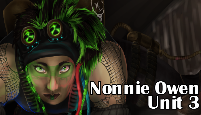
These are the two images I will be using. 


To produce both of these, I used Manga Studio 5 and the oil brush. This allowed me to achieve even blending along side colour application. 

Comic cover- final scamp

This is my final cover design. I really love how this turned out as it's simple yet charming. I feel like the only thing I would need to change/add would be the issue number and things like a barcode and artist names.

Comic content- final scamp


This is my final scamp for my comic, Uprising. I really like the colour scheme in terms that the almost monochromatic/sepia tones contrast nicely with the very saturated selected colours. To really get contrast on a page, I decided that there will be one specific colour that will be highlighted. 
I am unsure on whether I will be keeping the comic to this exact design, but I feel confident that I will be able to work with this to reach a successful design.

Thursday 8 January 2015

Fishing island Tai'O, Photo manipulation.


This is the original photo of some housing on the fishing island Tai'O. I thought this would be the most suitable to edit as it looks very cramped and packed with living spaces, just like how I wanted my underground city to look.


To begin with, I covered the backdrop with a dark brown to remove all out door scenery. This way I could work with it to make the picture look more 'underground'.


After that, I then altered the saturation and luminosity to make it darker and reduce the affect of natural light. This way I could make the image a lot more grunge.


Using an Overlay layer setting, I created dramatic shadowing and low lighting. Though effective, I found it to be too dark. To fix this, I used the idea of the lamps from my protagonist bio. 


This is the final manipulation. I really like how it came out as it looks dark and underground with a hint of decay and poverty. I think if I were to do this again, I would probably make it a little less dark so that some of the details, such as the rust along the walls, are not lost as I feel that they really gave the picture an authentic feeling.

Fishing island Tai'O, photography.


In 2011, I traveled with my parents to Hong Kong. We lived in the city for two months, and during which time, we decided to visit some of the fishing islands. This is Tai'O, one of the main fishing islands.  It was the derelict looking huts which have been the main inspiration for the design of my underground City in my comic. The boggy marshlands and dirty looking housing provided a great photography opportunity, and with a bit of photo manipulation, I feel as though these could be used as a base for my City.


This is one of my favourite photographs from the ones I took as I really like the colour composition. I love how the green door, window frames, and plants really compliment the rusted walls and roof, and the scarlet new year decorations. 
I will most likely use this as a base for my "home" design, as out of all the photos I have taken, this hut seemed the most 'lived in'.


This is a photo of me in front of the huts for good measure, and to prove that I was there.  like the idea of having someone sat in front of the 'city', so I might use this as a pose reference for my main character.


This photo is pretty interesting as the hut itself was unlike the others. Though substantially smaller in terms of width, it was one of the only houses on the island to have a second floor. The photo really does not do justice to how small these buildings were, but if you look at the door for size comparison, then you will see how petite the buildings actually are.
Wednesday 7 January 2015

High City: Photographs


After taking ideas of improvement into consideration, I then developed the original design for the Revolutionary and created an outfit which I could dress my roommate in so that she could replicate a live action version of my character. I took influences from various sources, the main source being the setting of the Hunger Games' Capitol City. I also took influence from Japanese geisha fashioin which can be seen in the belt of the model, which is actually based off an Obi.
To give a sense of class, I used a rich looking material for the back drop.


I wanted the Revolutionary to have an instantly recognisable character design. I also wanted to focus on the design of the makeup, as I feel that it would be very dramatic in the High City. I had experimented with some bright colours, but I find that white looked the most sophisticated. I decided to stick to white details as it works well with the blue hair of the model to give a nice cool feeling to contrast against the warm colour and texture of the jacket.
To prove a sense of wealth, people in the High City would have short unnatural coloured hair as it is a lot of maintenance and would show that you could afford the upkeep.
The same is to be said about body modifications. Things like elf ears, piercings, or tattoos are again a show of wealth as it proves that you could afford to pay a professional to mark your body.

Civilian Bio

To help create the setting for my comic, I designed the average citizen for both cities. This was mainly to demonstrate the key difference between the two class systems and add some depth into the comic.
I really like the designs for both. I think if I was going to develop the designs, I would probably alter the High City's design to be something a bit more dramatic. 
What I found to be the most inspiring was the Hunger Game's idea of futuristic wealthy fashion in the Capitol. It was this which gave great influence in my design.

Friday 2 January 2015

Revolutionary.

I wanted to create a character that wasn't on either 'side' of the situation, and that could help move the story along on neutral grounds so that it isn't always action. This way the comic would have more of  balance between plot and action.
I plan to have her lead the comic's revolution in a more political way, than actually get involved with the physical element of battle.