Friday 21 November 2014

Protagonist Bio

After developing the landscapes, I thought it would also be good to develop the protagonist of the comic, and add further detail to build the character.  I love presenting Bios in a sketchy style as it shows that the character is still in the stages of development. 

Landscape scamps

As the theme of my comic is somewhat Scifi, I decided that it would be a good idea to watch films and gameplay, such as Repo the genetic opera, that have a similar visionaries like the ones I had imagined.

Using these as inspiration, I decided to sketch up some landscape ideas to set an atmosphere for my comic. 


Monday 10 November 2014

Emulation 2


This is my Jim Lee emulation. I really enjoyed working in this style. To achieve a more rustic feel to the piece, I used a calligraphy pen and ink.
Though I enjoyed working traditionally, I preferred working digitally as it is a lot easier to sketch and line work in a shorter time period.

Emulation 1


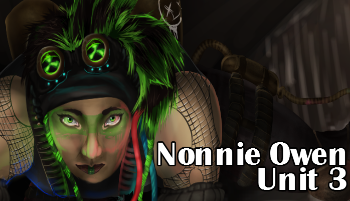
This is my emulation of Abraham Lopez. After browsing his gallery on DeviantArt, I noticed that the majority of his portraits were a pin up of popular comic or game characters. In light of this, I decided to do a mock pin up of the main character from the comic I am designing and making for Unit 3.
I am very pleased with how this turned out.
If I were to redo this emulation, I would improve on the clear crisp lines of the cell shading.
To do this, I would use a stabiliser on the brush settings to avoid any wobbly lines.
To create my emulation, I first had to think of a pose for the character I was going to draw.
As the majority of Lopez's art involving singular characters are often posed in such a a way (along side exaggerated expressions) that their personality almost shines through. This is why I have chosen a neutral pose with a confused expression.

To ensure that the colouring keeps tidy and within the lines, I used cripple layers over a dark grey base. The grey would contrast with any colour I added as it is not at all saturated, meaning that I would be able to spot any errors a lot easier.
The first layer set of colours were my flat base colours. This creates an even palette and gives a basic idea of how the colours will contrast.
Over the base colours I added flat cel shading. I really like the cartoony effect this has on a piece.
Using a soft brush, I added some subtle highlights. This contrasts against the dark cel shading and adds a nice finished feeling to the piece.
I had noticed in Lopez's work that he often includes little rough speech bubbles with limited words, characters (such as an explanation or question mark), or what could be considered some kind of dingbat illustration. To match with her confused expression, I thought a question mark would look the most interesting, and leaves the viewer to interpret what it is she could be asking.
I am really happy with how this turned out. 


Copy 2


This is an original Wizard comic cover illustrated by Lee Jim. I chose to copy this style because I really like the use of directional lines to create tone and shape.
 This is the first stage of my copy. I used a rough sketch to get a basic idea of shape and proportion.

This is the second stage of my copy. This is where I add detail and alter sizes so that I can get the copy as close as possible to the original.
This is my finished copy of the original. I have used black to give the effect of an inked piece. I am pretty happy with how this came out, though if I were to do it again, I would try and make the characters a little more narrow, as I have drawn them a little too wide compared to the original.

Tuesday 4 November 2014

Copy 1


Original art ("Happy Halloween") by Abraham Lopez. I chose to emulate Abraham because I adore his style. I love the way he uses cell shading with gentle gradients in his work, and as I work in a more painterly style myself, I thought it would be interesting to try out something different.
This is my copy of the piece. I replicated Abraham by first lining an observational sketch and using crippling layers with gradients to help achieve a neat colour.
I have made a GIF set of the entire process and I am very happy with the result.